part 1mixed
The following charts illustrate the number of tourists visiting Australia from three different countries in 1995 and 2005, as well as the trends in types of travel chosen by tourists between 1995 and 2005. Provide an overview of the information by identifying and describing the key details, and include comparisons where appropriate.
The following charts illustrate the number of tourists visiting Australia from three different countries in 1995 and 2005, as well as the trends in types of travel chosen by tourists between 1995 and 2005. Provide an overview of the information by identifying and describing the key details, and include comparisons where appropriate.
 View samplesarrow_forward
part 1line graph
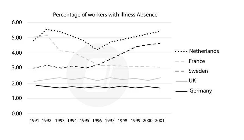
The graph below shows the percentage of workers from five different European countries that were absent for a day or more due to illness from 1991 to 2001.Summarise the information by selecting reporting the main features, and make comparisons where relevant.
The graph below shows the percentage of workers from five different European countries that were absent for a day or more due to illness from 1991 to 2001.Summarise the information by selecting reporting the main features, and make comparisons where relevant.
 View samplesarrow_forward
part 1line graph
The graph below shows the CO2 emissions of five regions from 2000 to 2020, and predictions up to the year 2040. Provide an overview of the information by identifying and describing the key details, and include comparisons where appropriate.
The graph below shows the CO2 emissions of five regions from 2000 to 2020, and predictions up to the year 2040. Provide an overview of the information by identifying and describing the key details, and include comparisons where appropriate.
 View samplesarrow_forward
part 1map
[2024] The maps below show Huntingdon as it is now, and how it will change in the future
The maps below show Huntingdon as it is now, and how it will change in the future. Provide an overview of the information by identifying and describing the key details, and include comparisons where appropriate.
 View samplesarrow_forward
part 1bar chart
[2024] The bar chart below shows the proportion of individuals in the UK consuming five portions of fruits and vegetables daily between 2001 and 2008
The bar chart below shows the proportion of individuals in the UK consuming five portions of fruits and vegetables daily between 2001 and 2008. Provide an overview of the information by identifying and describing the key details, and include comparisons where appropriate.
 View samplesarrow_forward
part 1line graph
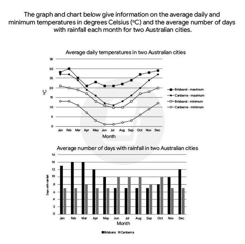
The graph and chart below give information on the average daily maximum and minimum temperatures in degrees Celsius and the average number of days with rainfall each month for two Australian cities. Summarise the information by selecting and reporting the main features and make comparisons where relevant
The graph and chart below give information on the average daily maximum and minimum temperatures in degrees Celsius and the average number of days with rainfall each month for two Australian cities. Summarise the information by selecting and reporting the main features and make comparisons where relevant
 View samplesarrow_forward
part 1line graph
[2024] The graph below gives information about the trends in birth rates among women in six age groups in the UK between 1973 and 2008
The graph below gives information about the trends in birth rates among women in six age groups in the UK between 1973 and 2008. Provide an overview of the information by identifying and describing the key details, and include comparisons where appropriate.
 View samplesarrow_forward
part 1bar chart
[2024] The chart below illustrates the percentage changes in car ownership among households in a European country from 1971 to 2001
The chart below illustrates the percentage changes in car ownership among households in a European country from 1971 to 2001. Provide an overview of the information by identifying and describing the key details, and include comparisons where appropriate.
 View samplesarrow_forward
part 1table
[2024] The table provides data on the number of students enrolled in six different departments at an Australian university in 2009
The table provides data on the number of students enrolled in six different departments at an Australian university in 2009. Provide an overview of the information by identifying and describing the key details, and include comparisons where appropriate.
 View samplesarrow_forward
part 1process
[2024] The diagram below illustrates the process of producing soft cheese
The diagram below illustrates the process of producing soft cheese. Provide an overview of the information by identifying and describing the key details, and include comparisons where appropriate.
 View samplesarrow_forward
part 1pie chart
The graphs below show the age of visitors from the UK to Spain in 1983 and 2003. Provide an overview of the information by identifying and describing the key details, and include comparisons where appropriate.
The graphs below show the age of visitors from the UK to Spain in 1983 and 2003. Provide an overview of the information by identifying and describing the key details, and include comparisons where appropriate.
 View samplesarrow_forward
part 1bar chart
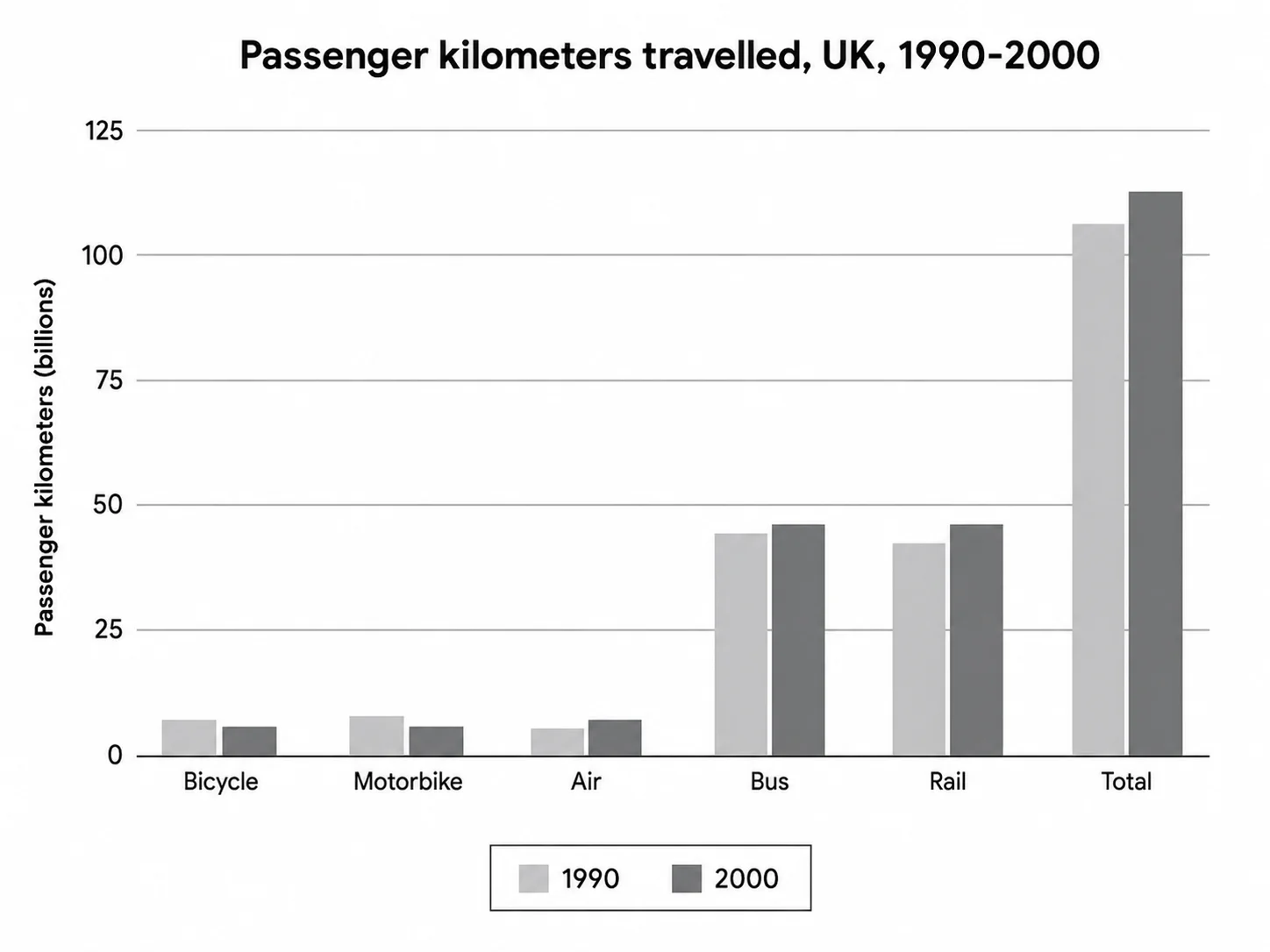
[2024] The chart below provides information about the total distance travelled by passengers via five transport modes in the UK during the years 1990 to 2000
The chart below provides information about the total distance travelled by passengers via five transport modes in the UK during the years 1990 to 2000. Provide an overview of the information by identifying and describing the key details, and include comparisons where appropriate.
 View samplesarrow_forward
part 1line graph
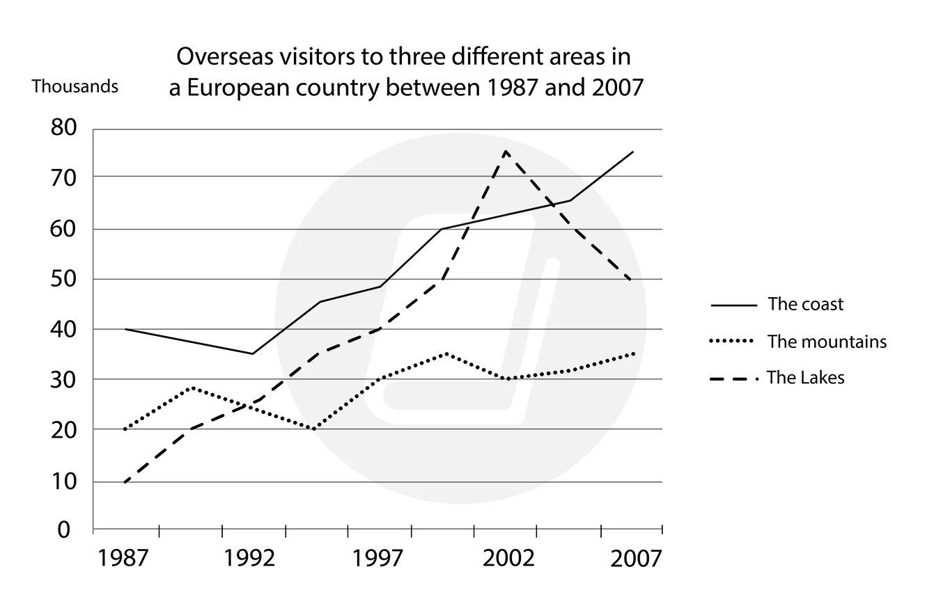
The graph below shows the number of overseas visitors to three different areas in a European country between 1987 and 2007. Summarise the information by selecting and reporting the main features and make comparisons where relevant.
The graph below shows the number of overseas visitors to three different areas in a European country between 1987 and 2007. Summarise the information by selecting and reporting the main features and make comparisons where relevant.
 View samplesarrow_forward
part 1bar chart
The chart below shows the donations given to six different types of charity by one company from 2012 to 2014. Provide an overview of the information by identifying and describing the key details, and include comparisons where appropriate.
The chart below shows the donations given to six different types of charity by one company from 2012 to 2014. Provide an overview of the information by identifying and describing the key details, and include comparisons where appropriate.
 View samplesarrow_forward
part 1table
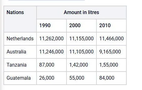
The table below shows the production of milk annually in four countries in 1990, 2000 and 2010.
The table below shows the production of milk annually in four countries in 1990, 2000 and 2010.
 View samplesarrow_forward
part 1table
[2024] The tables below provide data on potato consumption and production across various world regions in 2006
The tables below provide data on potato consumption and production across various world regions in 2006. Provide an overview of the information by identifying and describing the key details, and include comparisons where appropriate.
 View samplesarrow_forward
part 1mixed
[2024] The table and pie charts below provide information about the number of research students at Australian universities in 2001 and 2010
The table and pie charts below provide information about the number of research students at Australian universities in 2001 and 2010. Provide an overview of the information by identifying and describing the key details, and include comparisons where appropriate.
 View samplesarrow_forward
part 1bar chart
The first chart below shows the proportion of school-aged girls and boys who were at secondary school in four world regions in 2000. The second chart shows the percentages of college-aged men and women in higher education in the same year. Provide an overview of the information by identifying and describing the key details, and include comparisons where appropriate.
The first chart below shows the proportion of school-aged girls and boys who were at secondary school in four world regions in 2000. The second chart shows the percentages of college-aged men and women in higher education in the same year. Provide an overview of the information by identifying and describing the key details, and include comparisons where appropriate.
 View samplesarrow_forward
part 1table
The table below shows the percentage of lawyers choosing jobs in different fields in a specific country between 2001 and 2016. Provide an overview of the information by identifying and describing the key details, and include comparisons where appropriate.
The table below shows the percentage of lawyers choosing jobs in different fields in a specific country between 2001 and 2016. Provide an overview of the information by identifying and describing the key details, and include comparisons where appropriate.
 View samplesarrow_forward
part 1line graph
[2024] The graph provides information about the number of people who immigrated to three nations between 1990 and 2001
The graph provides information about the number of people who immigrated to three nations between 1990 and 2001. Provide an overview of the information by identifying and describing the key details, and include comparisons where appropriate.
 View samplesarrow_forward
part 1table
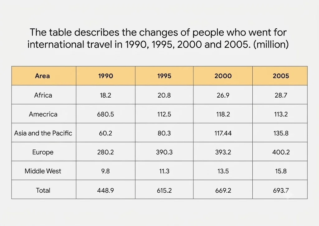
The table describes the changes of people who went for international travel in 1990, 1995, 2000 and 2005 (million). Summarise the information by selecting and reporting the main features, and make comparisons where relevant.
The table describes the changes of people who went for international travel in 1990, 1995, 2000 and 2005 (million). Summarise the information by selecting and reporting the main features, and make comparisons where relevant.
 View samplesarrow_forward
part 1bar chart
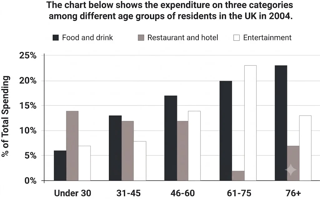
The chart below shows the expenditure on three categories among different age groups of residents in the UK in 2004. Summarise the information by selecting and reporting the main features, and make comparisons where relevant.
The chart below shows the expenditure on three categories among different age groups of residents in the UK in 2004. Summarise the information by selecting and reporting the main features, and make comparisons where relevant.
 View samplesarrow_forward
part 1line graph
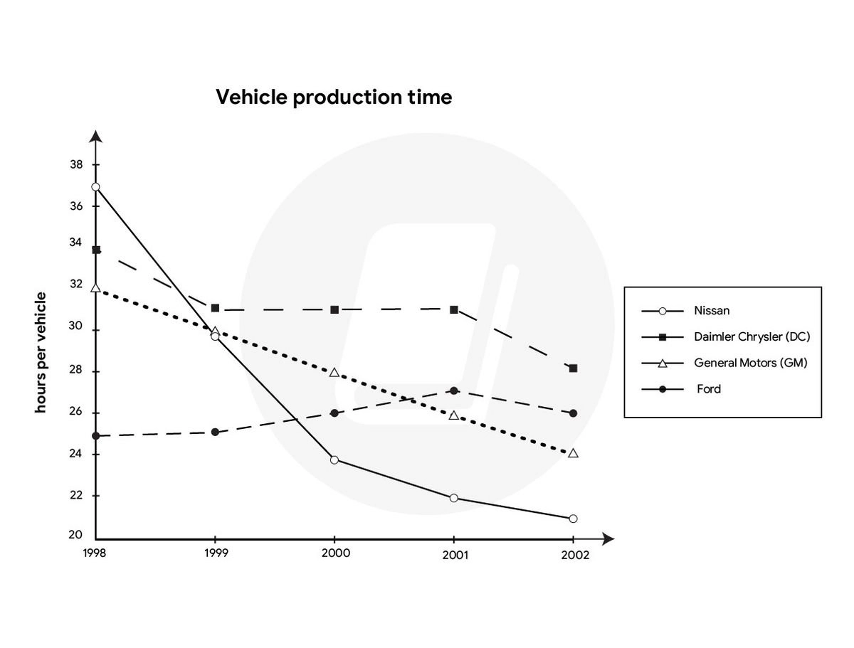
You have approximately 20 minutes to complete this task. The chart below gives information on the amount of time taken to manufacture a vehicle by four US-based car producers between 1998 and 2002. Provide an overview of the information by identifying and describing the key details, and include comparisons where appropriate.
You have approximately 20 minutes to complete this task. The chart below gives information on the amount of time taken to manufacture a vehicle by four US-based car producers between 1998 and 2002. Provide an overview of the information by identifying and describing the key details, and include comparisons where appropriate.
 View samplesarrow_forward
part 1bar chart
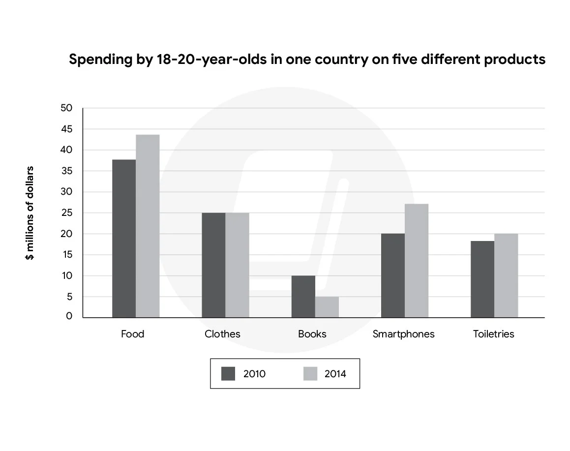
The chart below shows the spending by 18-20-year-olds in one country on five different products in 2010 and 2014. Provide an overview of the information by identifying and describing the key details, and include comparisons where appropriate.
The chart below shows the spending by 18-20-year-olds in one country on five different products in 2010 and 2014. Provide an overview of the information by identifying and describing the key details, and include comparisons where appropriate.
 View samplesarrow_forward