IELTS Mate
Samples Writing
116 essays graded by AI
Pie chart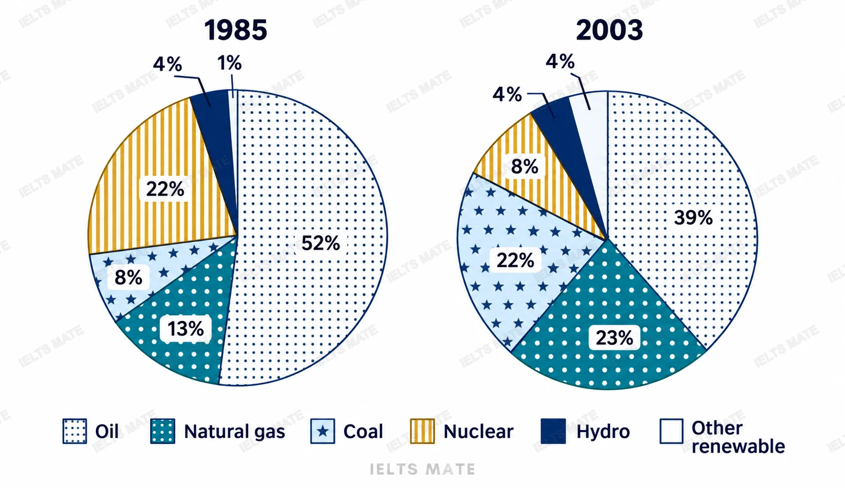
The charts below show the proportion of the energy produced from different sources in a country between 1985 and 2003. Summarize the information by selecting and reporting the main features, and make comparisons where relevant.
inbox
No samples for this band yet.